Creating Nester: a one-stop digital textbook platform.
Academy Xi
TIMELINE
Project
MY ROLE
February - March 2022
Product designer
OVERVIEW
How can we ease the financial burden and physical challenges of textbooks?
For our first project at Academy Xi, we were presented with three conceptual challenges to choose from. However, none of these appealed to me.
Reflecting on my own experiences in late high school, lugging around textbooks can be a cumbersome ordeal. More often than not, this experience is compounded by the overwhelming volume of learning content, and premium price tags often for a single-use purpose.
Despite these challenges, textbooks excel at providing in-depth explanations, making them valuable resources for those who thrive on independent learning.
Yet, the common financial burden often forces students into alternative strategies, such as borrowing from libraries or not even purchasing them at all.
This realisation led me to take it upon myself to solve this challenge, seeking to reimagine textbooks as more accessible, engaging, and affordable resources for students like myself.
Here is the full problem I uncovered through user research, and the way that I solved it.
USER INTERVIEWS
I interviewed 7 students to learn their learning behaviours around textbooks
To validate my assumptions, I conducted research and user interviews with students of different levels of schooling (ages 18 - 24). More specifically, I wanted to learn their needs, motivations, and frustrations with their current methods of learning, and self-identify as textbook users.
Understand how students currently use textbooks for studying and learning
Find out what frustrates students most about textbooks and the learning process
Discover how students feel and behave when buying textbooks
Understand students’ perceived level of importance or general attitudes towards the learning process
Understand how students feel about the relevance and quality of textbooks they are using.
Objectives for 1:1 interviews
FINDINGS & ANALYSIS
Overall, students feel that textbooks are an essential part of their learning process but are frustrated by its high costs, outdated content, and limited relevance.
With each major insight on a sticky note, I grouped the insights by similarity and topic. The following themes emerged:
Affinity map
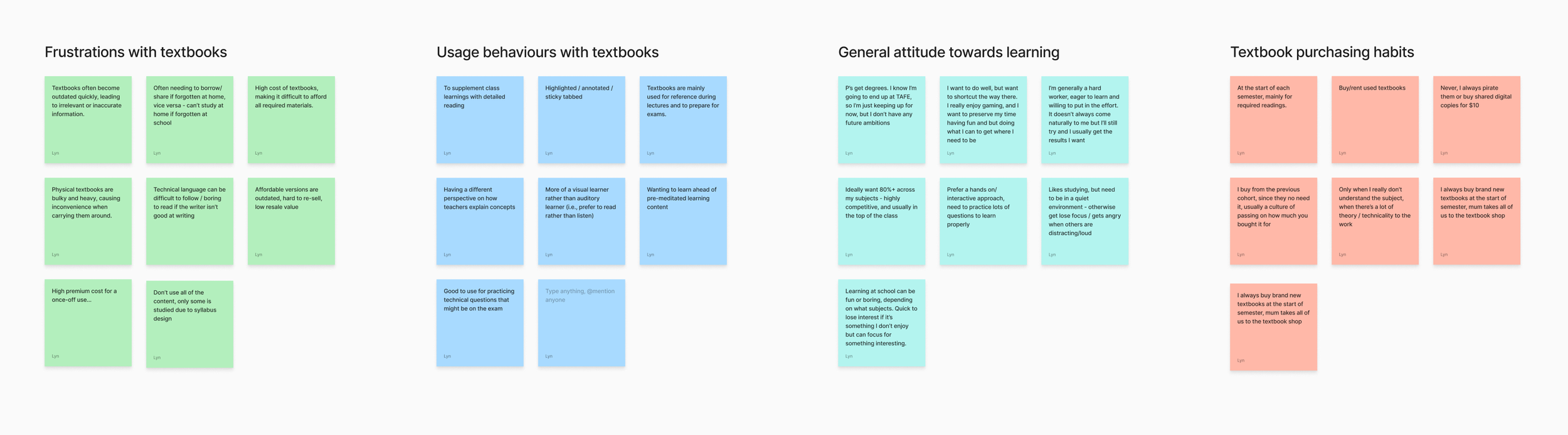
Textbooks can be heavy to carry, taking up a lot of space in backpacks, especially for commutes to and from classrooms, and the school and home.
1
Heavy and bulky
It’s no secret that textbooks are priced at a premium, creating a financial burden for those who are already combatting other life expenses, such as rent.
Renting or reselling books doesn’t always make up for the initial cost, and some books are difficult to resell because they’re customized for specific courses or editions.
2
Breaking the bank
Challenges with relevancy
3
Textbooks often leave content uncovered by syllabi, are designed for single-use, and may create knowledge gaps when using older editions, which, while more cost-effective, may not align with the current curriculum.
The worst part is when you buy a brand-new edition of a textbook, and it turns out that the changes are minimal. I paid $200 for this book, and I barely used it because the information was practically the same as last year's edition. I could’ve just not have bought it.
The weight of textbooks makes me feel like I’m walking around with a backpack full of bricks. I live an hour away from school by train, and I walk 15 minutes to the station every day, so you can imagine how sore my shoulders get.
Personas
Based on my research, I defined 3 user archetypes, and mapped them to their respective jobs-to-be-done.

She/he has a high willingness to pay. She values quality, accurate, and comprehensive learning materials.
The Academic Sage
When starting my learning journey, I always buy the textbooks prescribed by my subject syllabi so that I know that what I’m learning is relevant.
JOBS-TO-BE-DONE
She/he is cost-conscious, seeking cost-effective alternatives for acquiring textbooks and other paid learning material.
The Modern Saver
People might call me stingy, but I’m always wanting to find the best bang for my buck without compromising my wallet.
JOBS-TO-BE-DONE

The Digital Scholar
She/he embraces the development of technology, unconventionally preferring digital materials over traditional physical learning materials.
JOBS-TO-BE-DONE
When I travel, I want to be able to access all my learning content wherever I go so that I avoid having to rely on always having my things with me.
Key user needs
Based on my research, I sought to improve the following key facets whilst keeping all other factors of the traditional user experience consistent (i.e., content, ability to highlight/bookmark pages).
Students need affordable access to textbooks, as the recurring high costs of physical textbooks every year/ semester create financial barriers and limits accessibility towards learning and participation towards the syllabus.
1
Improve cost-effectiveness
Re-imagine portability and convenience
2
Students need a solution that eliminates the physical burden of carrying bulky, heavy books from class to class and home.
This would also mean that they need to be able to access their textbooks and materials regardless of location, without worrying about forgetting books at home or being unable to access them on the go.
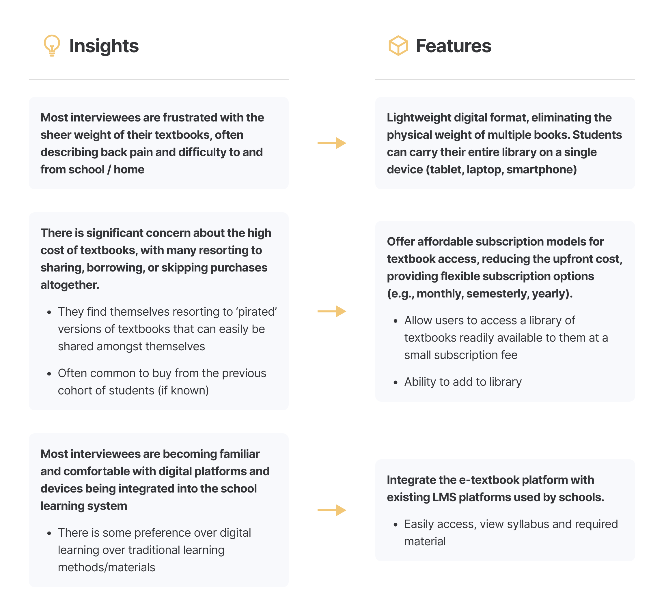
IDEATION (CONT.)
Transforming friction to flow
Connecting the dots with a feature roadmap
From the three major frustrations that most interviewees expressed, I outlined two main features that this MVP could have.
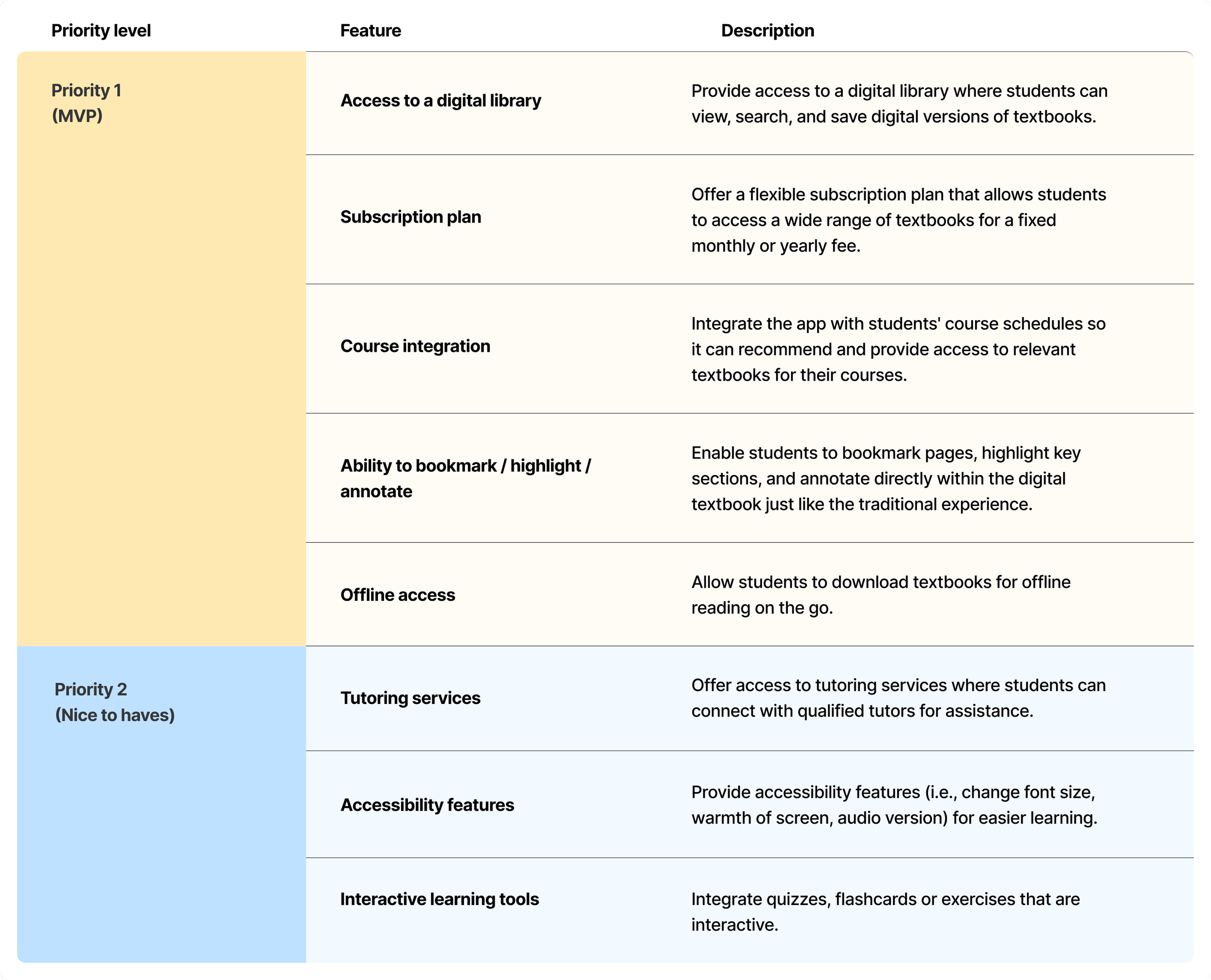
Determining the Needs and Nice to Haves
After I established the basic functionality to prioritise, I got excited and brainstormed features that I could explore in future designs. Below are list of features in order of priority. Due to the time constraints of this project, I addressed only the core features.
IDEATION (CONT.)
Bridging the gap between the world of traditional textbooks and the emerging potential of digital learning
With features prioritised, I started piecing together the information architecture. I had initially envisioned a simple platform with just two sections: one for browsing a library of books, and one for the books that was saved/relevant to the user. I decided to join the textbook preview experience between the digital library and my books, so that when a book is previewed in the digital library, users can add it to My Books and jump straight into the reading view from there.
Site map
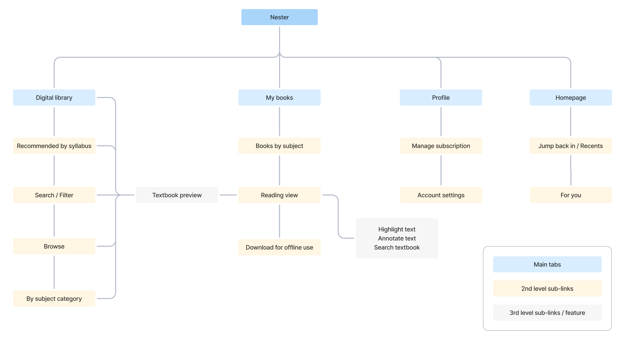
Once I was happy with the content organisation, I began thinking about how I wanted the user to interact with the platform to accomplish some important goals – create an account, add a textbook to the library, view the textbook and highlight the content. I included some decision points where a user may not want to pursue more information, or may want to skip a step.
I decided that users must integrate their school accounts in order to see recommended books as part of their learning syllabus.
User flow
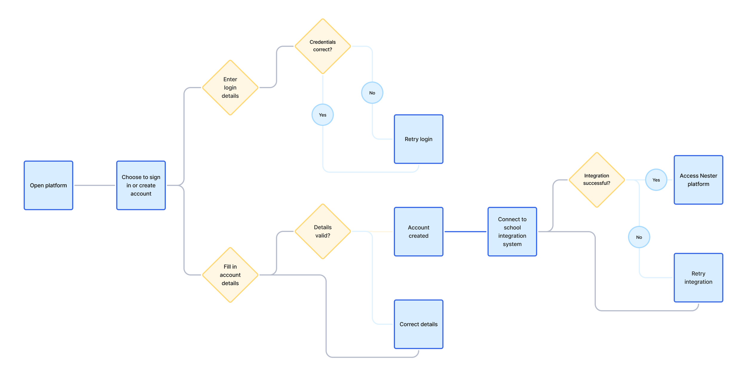
Log in or create account
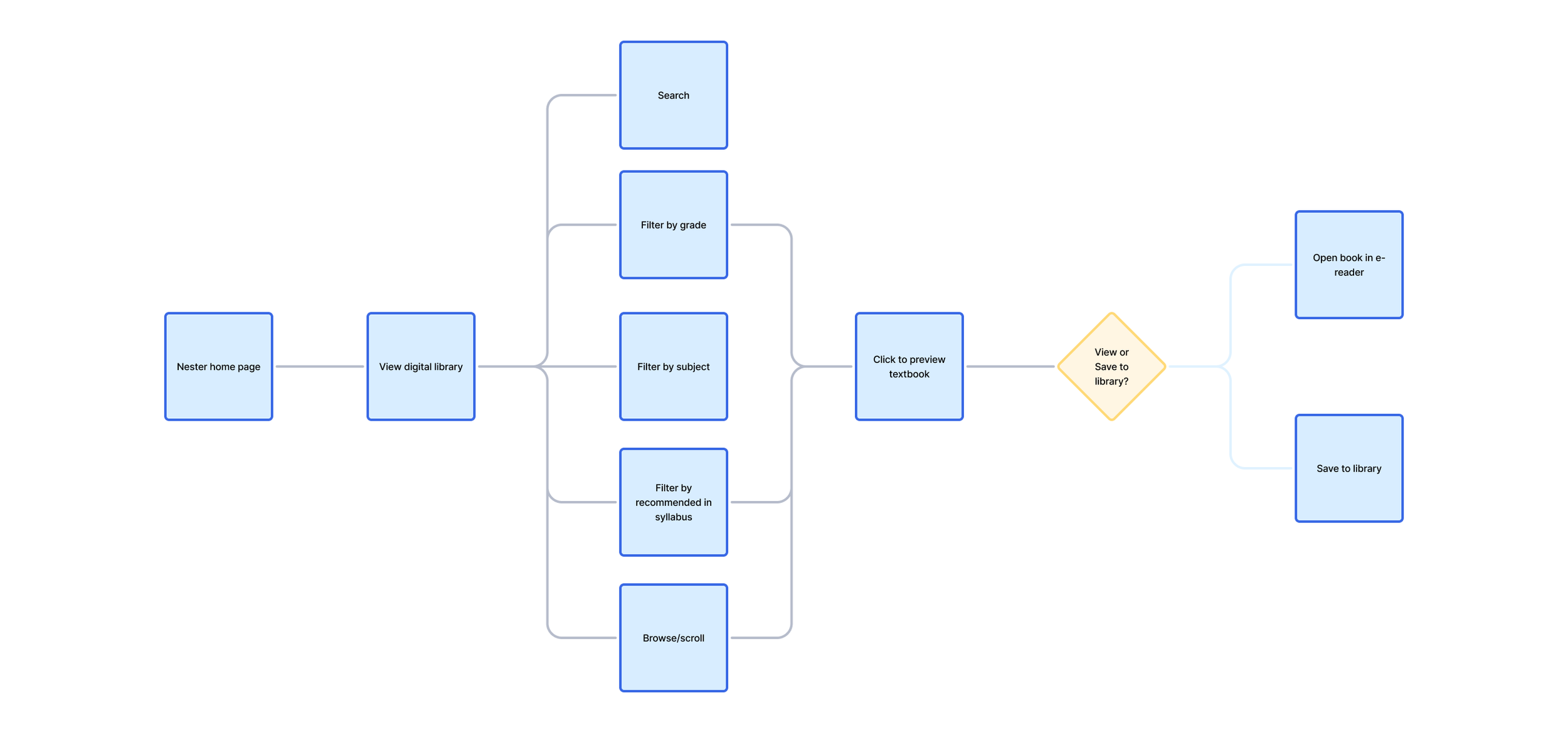
Search and add textbook to a library
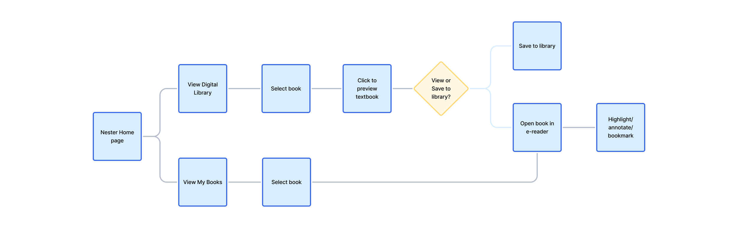
View the textbook in reading mode and highlight content
DESIGNS
So… what does this look like for the budding learner?
Based on the happy paths in my user flows, I iterated, and designed low-fidelity and high-fidelity screens specific to the 3 key flows above.
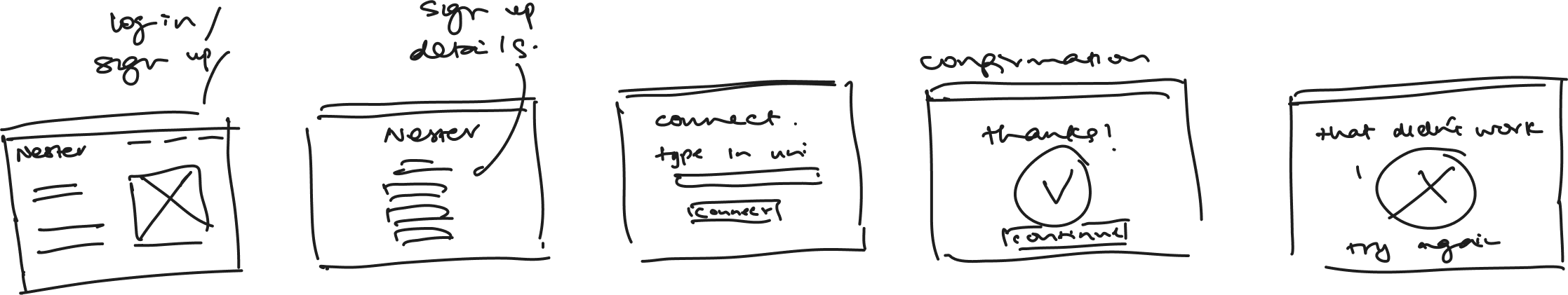
Low-fidelity designs
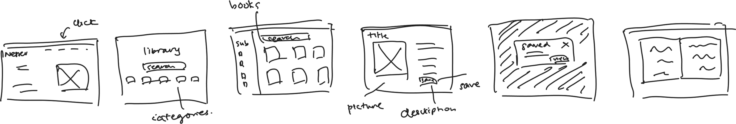
1. Log in or create account
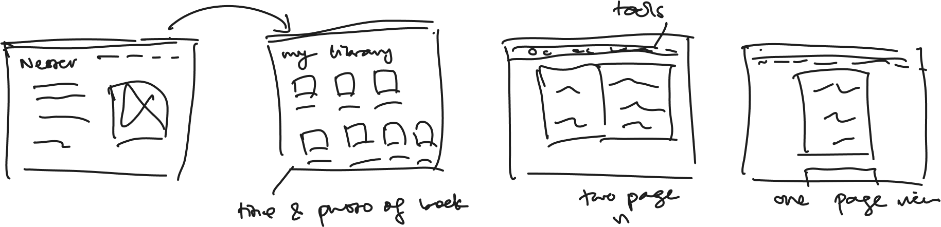
2. Search and add textbook to a library
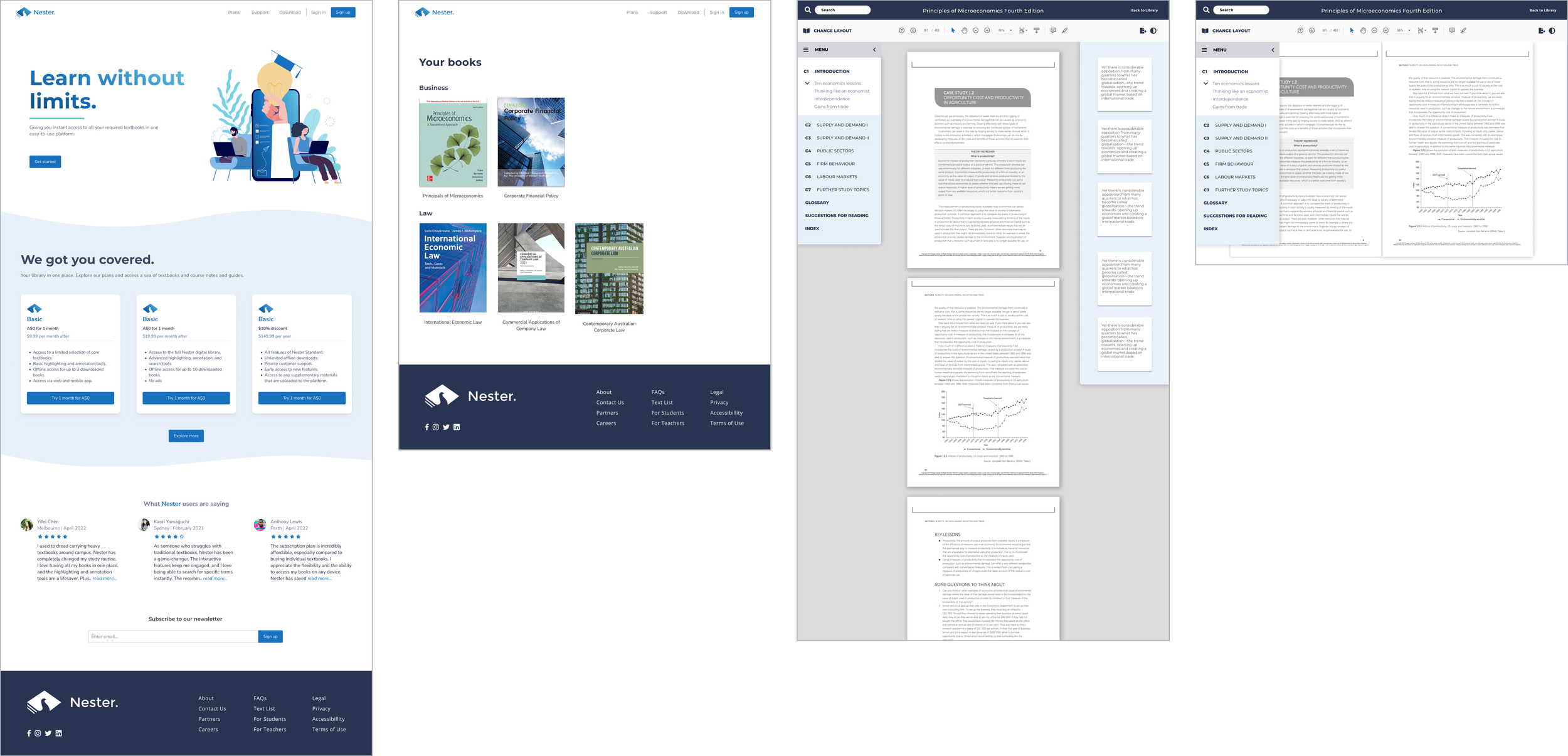
3. View the textbook in reading mode and highlight content
Mid-fidelity designs
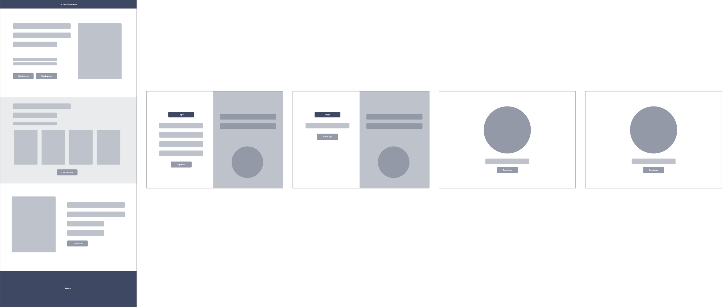
1. Log in or create account

2. Search and add textbook to a library
3. View the textbook in reading mode and highlight content
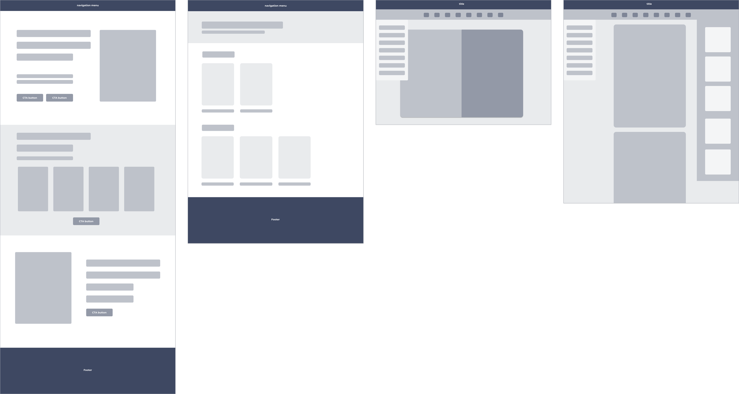
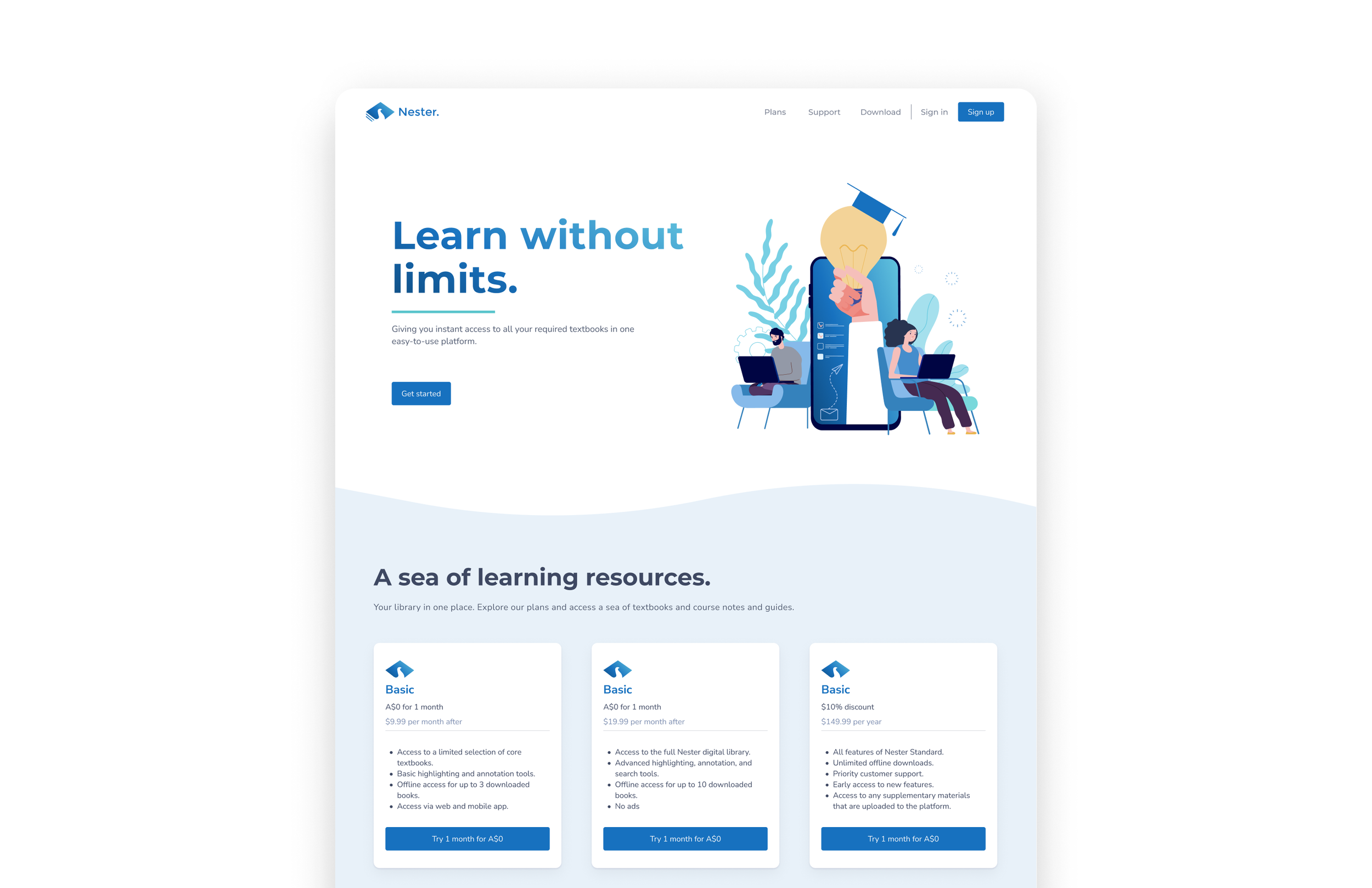
High-fidelity designs
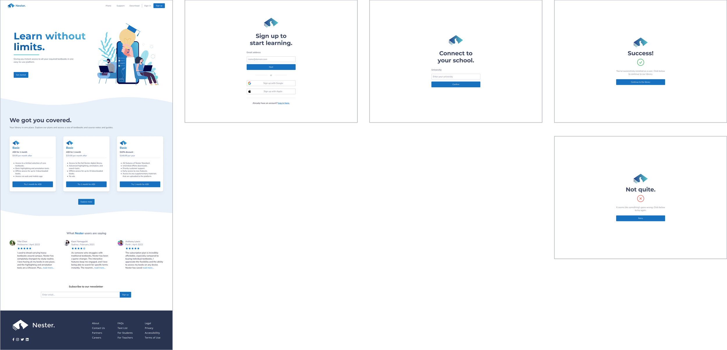
1. Log in or create account
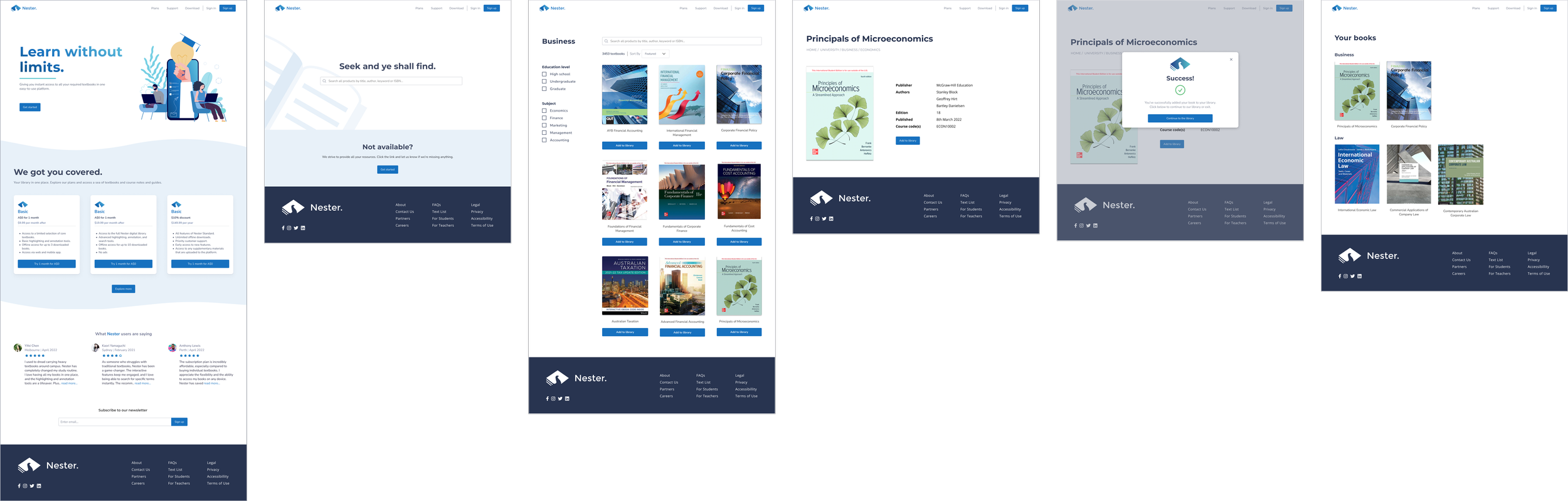
2. Search and add textbook to a library
3. View the textbook in reading mode and highlight content
In a mix of in-person and Zoom 1:1 usability tests, I tested the prototype with students who self-identified as textbook users. I measured success by the number of user errors and the reported ease of navigation through the tasks. I also wanted to see how well the app addressed users' pain points, motivations, and goals.
I tested seven users’ ability to complete these task flows in the prototype.
USABILITY TESTING
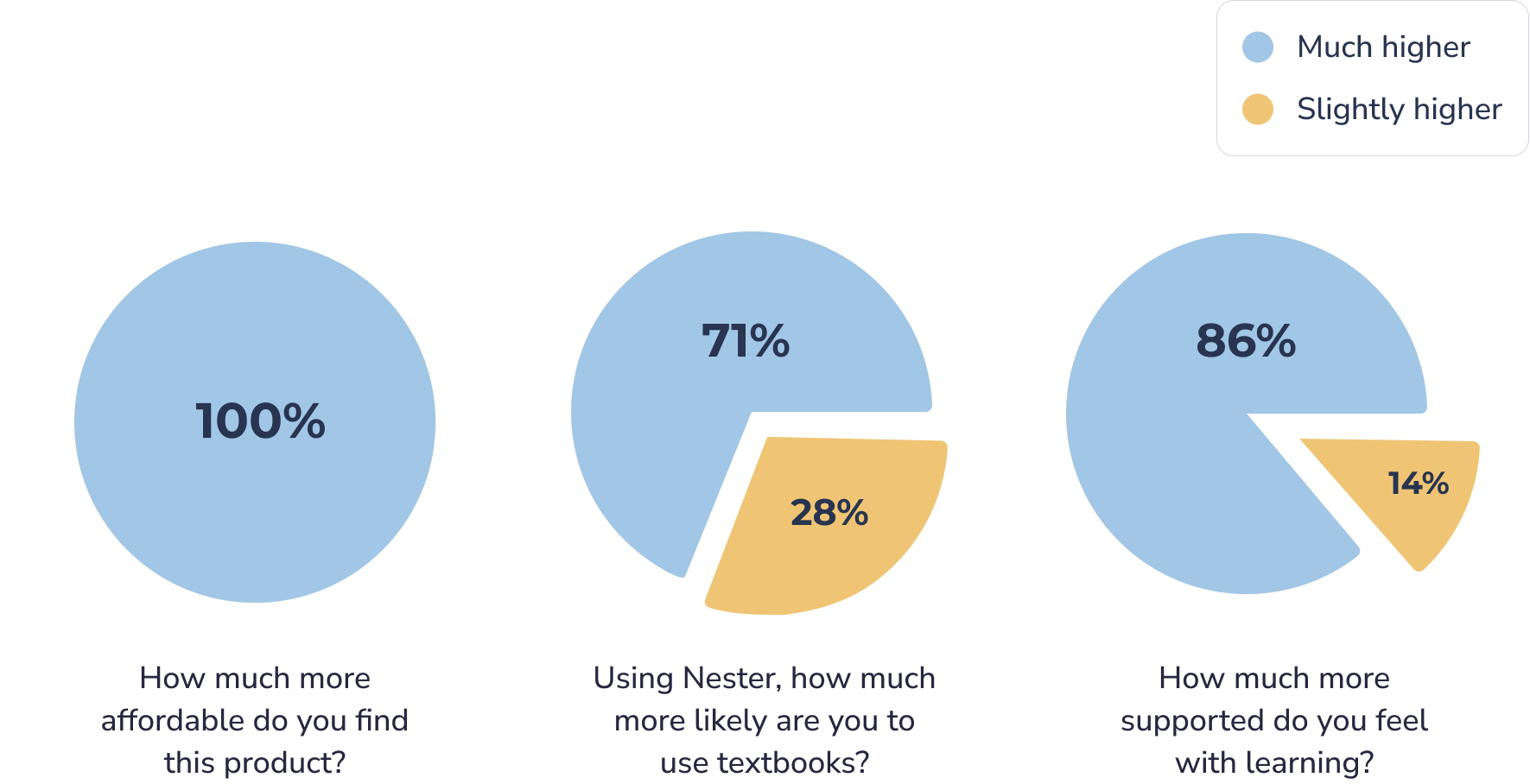
To quantitatively measure the success of the design, I broke down the larger design goals into detailed, measurable ones, and developed a questionnaire to help me answer those questions.
Usability test insights
Overall, participants navigated through the flows with ease – there were no errors or hesitation of any kind. However, they all had comments and questions about the content of the screens and the practicality of the features.
A round of affinity mapping revealed patterns of user confusion around certain features, especially around the current filtering design for thousands of books.
Here are the insights from the questionnaire:
I like the idea, but say… if the site is missing a book and I go to search and it’s not there, what will it look like?
I think the filters aren’t super easy for me to browse or find it is that I’m looking for. Like… how do I search for a subject? I also don’t find the number of books particularly useful.
I feel like there’s not a lot of information around the textbooks. The textbook page isn’t giving me super relevant info.
Below is my final solution to that problem, as well as how I addressed the rest of the user feedback.
Making the Good..Better.
Refining the filters
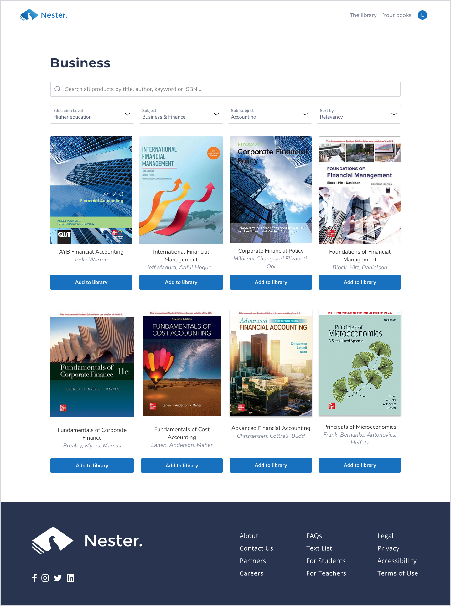
BEFORE
I had multi-select checkboxes that the user could select from on the left hand side panel, and I showed the numbers of books that the search returned.
AFTER
I removed the checklists, and included a dropdown design that the user could multi-select their options.
I included the author’s names and re-designed the layout in a way where it’s pleasing to the eye.
What books are relevant to you?
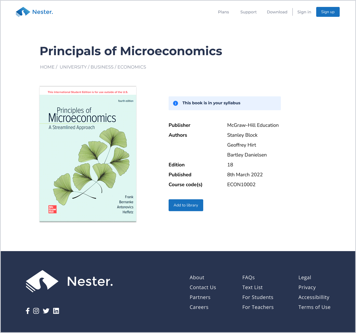
BEFORE
The same, just without the information panel.
AFTER
I included the information panel to educate the user that this book is in their syllabus. It’s now at my backlog as to how I might surface this to the user in other parts of the platform.
Uh oh! Didn’t think of that.
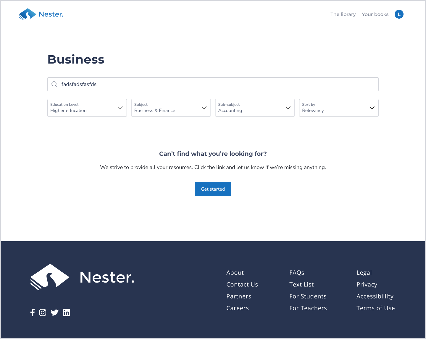
BEFORE
I had the error state in the ‘Search page’, but I didn’t consider this scenario until a user pointed it out.
AFTER
I included some copy to ease the user and a solution (CTA) if we’re unable to surface a book.
NEXT STEPS
My next step is to conduct another round of usability testing to see if this latest iteration resonates with users. I am also exploring the addition of a feature that allows users to interact with exercise questions, cards, and quizzes.
This was my first ever UX design project, and I loved seeing it come to life throughout the process. It was really meaningful to design a solution for such a prominent user problem that many students would relate to during their learning journey – myself included.
Nester is still a work in progress, on its way to becoming a feature laden digital learning ecosystem.
See more of my work…